Showing posts with label Gemma Jackson. Show all posts

Wednesday, 25 April 2012

Wednesday, 28 March 2012

Final Film

Somethings wrong with the titles guysss....I think we missed one off and it says and Gemma Jackson twice :L


Production logo

We have partly started to create our production logo.
We have decided to call ourself satanic productions, to correspond with our film genre

We will finish off our logo today as photoshop was being un-cooprative.

Its mostly black and white at the moment and we are going to add some colours

Makeup

When we first did a trial of our makeup. We realised that the white makeup we used looked uneven and unrealistic.
In our actual makeup process before we filmed our real shots, we used a large amount of the white makeup in layers to try and even it out as much as possible, we then dusted talcum powder of the white to even it out. This worked quite well and made the skin more realistic and smooth

Wig Update

The wig arrived on Monday 5th March so we was able to film on Wednesday 7th March

Soundtrack

We have made a soundtrack from scratch on Garage Band, this is so that it is our own work.
We have put the soundtrack we made onto the title sequence and we muted the audio that was in the footage.

The soundtrack connects with our genre as it creates suspense and is ghostly.
The audience will know that our genre is ghost because of this.

Editing

We have almost edited all of our film.
We have completely finished editing our titles. We have included writing which is in a red font and in the 'Drifting' animation so that it looks spooky but there is a contract so that the audiences attentions are drawn to it.
We have included some effects such as black and white, slowing down and speeding up and camera shake to give an added effect.

To finesh, we need to sort out the end of our film by making it smooth and in order.

Filming

We filmed our film on the Wednesday 7th March 2012. It took us about 6 hours to film.
We began to edit our film and realised we needed a few extra shots so that it was clear to the audience what was going on.
We then decided to re-film a few bits of our film on the Wednesday 21st March so that our film made more sense.

We was extremely behind because of the wig arriving so we could shoot, however we have made sure that we have caught up with and are on track with the deadline.

Friday, 9 March 2012

Film Set/Makeup Photo's


We documented each process of the makeup stage. The makeup took about 2 hours to get on. 

Monday, 27 February 2012

Production Company Logo Research

tp+logo.jpg
Twisted Pictures is an American independent production company, mainly creating films of the horror genre. The company was founded in 2004 by Evolution Entertainment's Mark Burg, Oren Koules and Gregg Hoffman. The Twisted Pictures Logo's are known for producing the Saw Film Series.
The font and colour of this logo is pretty simple, a contrast of the white writing and the black background makes the writing stand out and the font is pretty blocked. The stake and barbed wire around the writing draws attention to it, it also describes the genre of the film and lets the audience know that its a gory genre. The writing in directly in the middle of the screen and with the black-white contract the audience are drawn to it. 
The logo establishes the them and one of the coming feature by the barbed wire and steak which twists and cuts the writing. This suggests that the genre is gore and that the following feature has some sort of danger in it.

Lionsgate-logo-2011-a-l_0.jpg
Lions Gate Entertainment Corporation (commonly referred to as Lionsgate) is a North American entertainment company. It was founded 6th June 1997 in Vancouver, British Columbia. Up to 2011 it is known to be the most commercially successful independent film and television distribution company in North America.
The font and Colour of this logo all suggests danger. The colour red is often used to signal something as being 'Dangerous', also with the clouds in the background, the audience could resemble it as being the gates of hell. The writing kind of jumps out of the screen because of the 3D effect of the clouds in the background. The font is simple and is gold so a contrast is formed. If this contrast wasn't formed the writing would blend into the background. For the layout, the writing is in the middle of the screen, it almost looks as if it is flying. 
The logo establishes the theme and tone of the coming feature by stereotyping the colour red as being dangerous. The audience will feel fear about it and will feel as if the film will be about the devil and/or hell.


Screen+shot+2011-01-20+at+09.24.46.png

Legendary Pictures is an American film production company, whose parent company, Legendary Entertainment, is based in BurbankCalifornia and was founded by Thomas Tull in 2004. In 2005 the company concluded a 40-picture agreement to co-produce and co-finance with Warner Bros.
The font and the colour of this logo is very simple. It has a contrast of a black background and gold writing. The gold writing could suggest importance/ money. The writing is in the middle of the screen and also has a little logo above it. The audience is drawn to the writing as it is in the middle of the screen. 


Universal Pictures (sometimes called Universal City Studios or Universal Studios for short), a subsidiary of NBCUniversal, is one of the six major movie studios.
Founded in 1912 by Carl Laemmle, it is the oldest American movie studios still in continuous production; the next oldest is Paramount Pictures. On May 11, 2004, the controlling stake in the company was sold by Vivendi Universal to General Electric, parent of NBC.
As you can see here, the Universal Studios logo at the start of film 'Van Helsing' begins to burst into flames and then proceeds to be a part of a characters prop (a fire ball). The logo is manipulated to the films genre as Universal is such a wide spread logo for numerous film genres. 
The colour and font of this logo is a little complicated, The writing sweeps across the world and is in 3D, so it jumps out of the screen to the audience and is more interesting. T icon turns from colour to black and white to suit the film when it become a characters prop. There is still a contract between the writing/world to the background which is just plain black, this makes the logo even more interesting. Because the logo turns into the prop, the audience are immediately engrossed into the film.

Monday, 30 January 2012

Filming - Gemma

We have decided on a date for filming.
We realised that we need to have a full day so that we can get set up;
-lighting
-makeup
-actors
-costumes
These are just a few things we need to make sure we have got perfect before we start filming. We also need it to be dark outside.
We also need to hire out a camera, tripod, torch, and a blue gel for effect.

We will be filming on saturday 4th february.

Film poster - gem

This is the poster i have designed for my film. As you can see, i have linked it to the threat and the title. It shows that the film is a horror film and it also gives the films' certificate. 

poster inspirations- Gem


the-grudge-poster.jpgl_298130_e35503e6.jpg
These are the two main poster inspirations i've used to come up with an idea for my poster. The posters are from 'The Grudge' an 'The ring'. My poster will have some kind of resemblance to the threat so that the poster looks scary and therefore attracts attention. This also gives the audience an idea of the genre of the film. Both of these films' posters show that the films are ghost/demon. 

Sunday, 29 January 2012

Night gown costume - gem

This is the night gown that we are using for the costume of the threat.
Its a little bit big, and clean. So we are going to make it dirty, and also rip it and make it fit properly.
It comes to about the middle of the thigh on the actor, so the actor is going to wear some shorts and a vest underneathe.

Wednesday, 25 January 2012

baby photos -Gem

These are my baby pictures we are going to use for a scene in our opening titles. We are going to scribble out the faces and draw symbols on them. This will add a creepy effect, and will leave the audience wondering whats going on.
 There will also be a seperate title sequence sceene, where there is a hand actually drawing the symbals and scribbles on.


We each analysed a horror film opening to get an idea of what to do for our titles.

Makeup test shots - gem


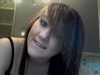
This is a before and after test shot of the actor that is going to be playing the threat character in our film.
We didnt have all of the resources needed to do the proper makeup we wanted, however this is just an idea.
we are going to put white makeup on her face, neck, chest, arms and legs. Make bruises with black, green, blue and purple eye shadows. distinguish features with black eye shadow. Also, by the picture, you can see that the white face paint is very uneaven and the black around the    eys sticks out alot. We came up with the idea of using talcum powder to blend in the back and also to make the white look more even. We also decided not to use the fake blood in the mouth as ther actor wasnt dressed properly and we didnt want to stain her clothes. But we have decided we will put the fake blood in her mouth so when she smiles it will all be in her teeth aswell as dripping down her chin.

The actor also isnt in costume here. She hasnt got her night gown on, or her long black wig.

Monday, 23 January 2012

IMDb Research - Gem

Insidious 2010


VotesAverage
Males 37,876 6.8
Females 9,029 6.9
Aged under 18 2,013 7.6
Males under 18 1,394 7.7
Females under 18 604 7.4
Aged 18-29 29,769 6.9
Males Aged 18-29 23,501 6.9
Females Aged 18-29 6,038 7.0
Aged 30-44 13,367 6.6
Males Aged 30-44 11,259 6.6
Females Aged 30-44 1,977 6.6
Aged 45+ 1,932 6.4
Males Aged 45+ 1,545 6.4
Females Aged 45+ 356 6.7
IMDb staff 10 6.1
Top 1000 voters 287 6.5
US users 12,155 6.9
Non-US users 28,651 6.7
IMDb users 49,103 6.8


As you can see, The film 'insidious' got the highest rating from people aged under 18. However, in the genders under 18, males rated the film higher than females. The film may appeal to them more because of how scary the film is. Females may not want to be traumatised by how scary the film is, this would appeal to men more. Also the film includes a child which is trying to be taken away by demons. Females would probably be more attached to the child as they have a stronger maternal instinct. However the difference between ratings is very little, so the film appeals to both sexes. As the people who rated the film got older, the ratings got lower also. This means that the film appeals to the younger generation rather than people ages over 30. This may be because of the genre of the film, 'demons and ghosts' are probably more realistic and thrilling for the younger people, whereas older people may find it unrealistic and not scary. However the film may have still made them jump and they still would have enjoyed it as the ratings aren't low.


Grave encounters


VotesAverage
Males 3,845 6.0
Females 797 6.5
Aged under 18 206 7.1
Males under 18 152 7.2
Females under 18 51 6.9
Aged 18-29 3,014 6.4
Males Aged 18-29 2,449 6.3
Females Aged 18-29 533 6.5
Aged 30-44 1,279 5.7
Males Aged 30-44 1,080 5.6
Females Aged 30-44 187 6.3
Aged 45+ 172 4.8
Males Aged 45+ 147 4.7
Females Aged 45+ 22 6.8
Top 1000 voters 48 5.0
US users 767 6.1
Non-US users 3,158 6.0
IMDb users 4,804 6.0


As you can see, the film 'grave encounters' appeals differently to a wide range of ages and between the sexes. there is a huge difference between the young gender audience and the older gender audience. in the older genders (45+), the film definitely appeals to the female audience more than the male. This may be because the older females may get more attached to the younger characters, they feel sorry for them and they get a thrill from wanting to care for them. They are also probably influenced by the film and want to care more. The males probably will not feel this bond with the characters and think that the film is a little bit unrealistic. However, this is the reverse for genders aged under 18. The males fount the film more appealing and rater it higher, although the females ratings were only a little bit behind. The film probably appeals more the the younger male generations rather than the older because the film has younger characters (18-25 years of age) included in the film. This means that the under 18 males (and females) will be able to relate to them more.