Production Logos:


The Hammer Production logo is simple and yet still follows the conventions of the ghost sub-genre. The colours imply danger and inspired us when creating our logo to use similar colours. We used the red, and our font makes it look like blood. We used a satanic symbol as this relates to our film and the name of our production company. We thought the background of the Hammer production was a bit plain so in ours we included grey and red scribles to make it look more appealing and eye-catching.
Title Sequences:


These are images from our title sequence and an exisiting films title sequence. The titles in the exisitng film are again yet simple and do not give too much away - it is just a black background with an image of lips. The image taken from our title sequence also doesnt give too much away although you can see more than you can in the other films title sequence. It inspired us to use simple yet effective images and to not give too much information to the audience.
Sub-Genre:
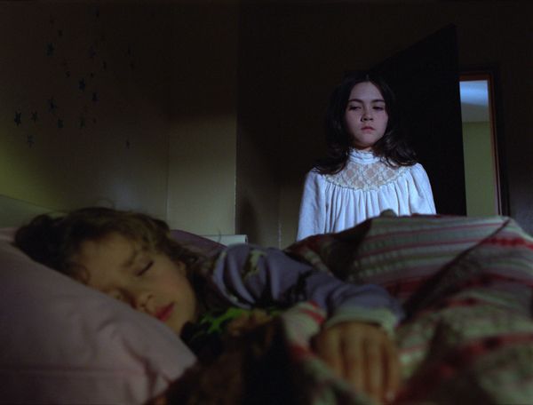

This is an image from orphan, which is a film in our sub-genre. The image shows the threat standing over the victim whilst she sleeps. It follows conventions of the sub-genre as the victim doesn't always know the threat is there. Facial expressions of the threat also show how lethal she may be, and how she feels about her victim. This inspired us to use similar facial expressions and for the threat to behave in a similar way. Our image shows the threat climbing up the stairs in a creepy way to show the audience that the victim is not safe.
Establishing Character:


Both of these images establish the relationships between the characters and the role these characters will play. In the sixth sense, the doctor is talking to the little boy and trying to comfort him. In our film the mother is going out and so is kissing her daughter goodbye, you can tell just from this that they are both nurturing characters. This helped us in our film to establish this role. The sixth sense follows conventions of our sub-genre as the boy has mental issues which occurs alot in our genre.
Mise-en-scene:


These images both show mise-en-scene used in horror films. The first image is taken from the film Oprhan and shows a good sense of location and also includes a prop and costume. You can tell from the costume and location that it is winter in this scene. In our film, we were inspired to show the action for the threats point of view in the bushes. The main factor in this shot is the location. We can see that it is a big, well-kept house through the use of the wide shot.The threat gets a lot of screen time through the use or editing in Orphan, so we decided to do the same thing, helping to establish the character.
4 Key Images:


The first image here is taken from The Ring, it shows the famous video tape which you die after watching. The second image is from our film, showing the threat reflecting through the lightswitch. We tried to come up with different ways to show the threat to make it more interesting and so to include more shot types. The story-line from The Ring helped us when we thought of our film as it is quite similar in terms of the threat. Both images conform to stereotypes of the ghost sub-genre as ours is showing the threat, and The Ring image is introducing the story-line.


Both of these images are very similar, and the image taken from Orphan inspired us with our threat. The facial expressions conform to the steretypes of a threat and so we tried to re-create this kind of image with our threat. You learn a lot about the character just from the facial expressions and body language in these images. The lighting in orphan helps the audience to clearly see the threats facial expression however in our film there had just been a powercut when the threat appears so we had to keep the lighting dark and not give too much away.


Both of these images show the threat coming into the story-line without the victim knowing. The bottom image, taken from Insidious has used lighting to conceal a lot of the threat from the audience, making them afraid of what they cannot see. This particular image helped to inspire us in our film with our threat popping up from no where. As with the image in insidious, you cannot see the whole of the threat and so leaves the audience wondering. The location which we used was appropriate and linked with the story well.


The first image here is taken from the film The Roommate, which shows a two-shot of two girls, and gives the audience a sense of the story-line from the mise-en-scence, mostly body language and facial expressions. One girl is creeping up on the other, following conventions of a horror film and so we tried to include this in our film. The second image here taken from our film is taken from inside the fridge when the character is getting a beer out of it. This inspired us to use a varitey of shot-types.
No comments:
Post a Comment