Showing posts with label Jess Freeman Evaluation. Show all posts
Showing posts with label Jess Freeman Evaluation. Show all posts
Thursday, 26 April 2012
Question 1 - Conventions
In what ways does your media product use, develop or challenge forms and conventions of real media products?
Production Logos:


The Hammer Production logo is simple and yet still follows the conventions of the ghost sub-genre. The colours imply danger and inspired us when creating our logo to use similar colours. We used the red, and our font makes it look like blood. We used a satanic symbol as this relates to our film and the name of our production company. We thought the background of the Hammer production was a bit plain so in ours we included grey and red scribles to make it look more appealing and eye-catching.
Title Sequences:


These are images from our title sequence and an exisiting films title sequence. The titles in the exisitng film are again yet simple and do not give too much away - it is just a black background with an image of lips. The image taken from our title sequence also doesnt give too much away although you can see more than you can in the other films title sequence. It inspired us to use simple yet effective images and to not give too much information to the audience.
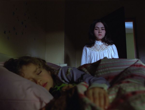
Sub-Genre:


This is an image from orphan, which is a film in our sub-genre. The image shows the threat standing over the victim whilst she sleeps. It follows conventions of the sub-genre as the victim doesn't always know the threat is there. Facial expressions of the threat also show how lethal she may be, and how she feels about her victim. This inspired us to use similar facial expressions and for the threat to behave in a similar way. Our image shows the threat climbing up the stairs in a creepy way to show the audience that the victim is not safe.
Establishing Character:


Both of these images establish the relationships between the characters and the role these characters will play. In the sixth sense, the doctor is talking to the little boy and trying to comfort him. In our film the mother is going out and so is kissing her daughter goodbye, you can tell just from this that they are both nurturing characters. This helped us in our film to establish this role. The sixth sense follows conventions of our sub-genre as the boy has mental issues which occurs alot in our genre.
Mise-en-scene:


These images both show mise-en-scene used in horror films. The first image is taken from the film Oprhan and shows a good sense of location and also includes a prop and costume. You can tell from the costume and location that it is winter in this scene. In our film, we were inspired to show the action for the threats point of view in the bushes. The main factor in this shot is the location. We can see that it is a big, well-kept house through the use of the wide shot.The threat gets a lot of screen time through the use or editing in Orphan, so we decided to do the same thing, helping to establish the character.
4 Key Images:


The first image here is taken from The Ring, it shows the famous video tape which you die after watching. The second image is from our film, showing the threat reflecting through the lightswitch. We tried to come up with different ways to show the threat to make it more interesting and so to include more shot types. The story-line from The Ring helped us when we thought of our film as it is quite similar in terms of the threat. Both images conform to stereotypes of the ghost sub-genre as ours is showing the threat, and The Ring image is introducing the story-line.


Both of these images are very similar, and the image taken from Orphan inspired us with our threat. The facial expressions conform to the steretypes of a threat and so we tried to re-create this kind of image with our threat. You learn a lot about the character just from the facial expressions and body language in these images. The lighting in orphan helps the audience to clearly see the threats facial expression however in our film there had just been a powercut when the threat appears so we had to keep the lighting dark and not give too much away.


Both of these images show the threat coming into the story-line without the victim knowing. The bottom image, taken from Insidious has used lighting to conceal a lot of the threat from the audience, making them afraid of what they cannot see. This particular image helped to inspire us in our film with our threat popping up from no where. As with the image in insidious, you cannot see the whole of the threat and so leaves the audience wondering. The location which we used was appropriate and linked with the story well.


The first image here is taken from the film The Roommate, which shows a two-shot of two girls, and gives the audience a sense of the story-line from the mise-en-scence, mostly body language and facial expressions. One girl is creeping up on the other, following conventions of a horror film and so we tried to include this in our film. The second image here taken from our film is taken from inside the fridge when the character is getting a beer out of it. This inspired us to use a varitey of shot-types.
Production Logos:

The Hammer Production logo is simple and yet still follows the conventions of the ghost sub-genre. The colours imply danger and inspired us when creating our logo to use similar colours. We used the red, and our font makes it look like blood. We used a satanic symbol as this relates to our film and the name of our production company. We thought the background of the Hammer production was a bit plain so in ours we included grey and red scribles to make it look more appealing and eye-catching.
Title Sequences:


These are images from our title sequence and an exisiting films title sequence. The titles in the exisitng film are again yet simple and do not give too much away - it is just a black background with an image of lips. The image taken from our title sequence also doesnt give too much away although you can see more than you can in the other films title sequence. It inspired us to use simple yet effective images and to not give too much information to the audience.
Sub-Genre:

This is an image from orphan, which is a film in our sub-genre. The image shows the threat standing over the victim whilst she sleeps. It follows conventions of the sub-genre as the victim doesn't always know the threat is there. Facial expressions of the threat also show how lethal she may be, and how she feels about her victim. This inspired us to use similar facial expressions and for the threat to behave in a similar way. Our image shows the threat climbing up the stairs in a creepy way to show the audience that the victim is not safe.
Establishing Character:

Both of these images establish the relationships between the characters and the role these characters will play. In the sixth sense, the doctor is talking to the little boy and trying to comfort him. In our film the mother is going out and so is kissing her daughter goodbye, you can tell just from this that they are both nurturing characters. This helped us in our film to establish this role. The sixth sense follows conventions of our sub-genre as the boy has mental issues which occurs alot in our genre.
Mise-en-scene:

These images both show mise-en-scene used in horror films. The first image is taken from the film Oprhan and shows a good sense of location and also includes a prop and costume. You can tell from the costume and location that it is winter in this scene. In our film, we were inspired to show the action for the threats point of view in the bushes. The main factor in this shot is the location. We can see that it is a big, well-kept house through the use of the wide shot.The threat gets a lot of screen time through the use or editing in Orphan, so we decided to do the same thing, helping to establish the character.
4 Key Images:

The first image here is taken from The Ring, it shows the famous video tape which you die after watching. The second image is from our film, showing the threat reflecting through the lightswitch. We tried to come up with different ways to show the threat to make it more interesting and so to include more shot types. The story-line from The Ring helped us when we thought of our film as it is quite similar in terms of the threat. Both images conform to stereotypes of the ghost sub-genre as ours is showing the threat, and The Ring image is introducing the story-line.

Both of these images are very similar, and the image taken from Orphan inspired us with our threat. The facial expressions conform to the steretypes of a threat and so we tried to re-create this kind of image with our threat. You learn a lot about the character just from the facial expressions and body language in these images. The lighting in orphan helps the audience to clearly see the threats facial expression however in our film there had just been a powercut when the threat appears so we had to keep the lighting dark and not give too much away.

Both of these images show the threat coming into the story-line without the victim knowing. The bottom image, taken from Insidious has used lighting to conceal a lot of the threat from the audience, making them afraid of what they cannot see. This particular image helped to inspire us in our film with our threat popping up from no where. As with the image in insidious, you cannot see the whole of the threat and so leaves the audience wondering. The location which we used was appropriate and linked with the story well.

The first image here is taken from the film The Roommate, which shows a two-shot of two girls, and gives the audience a sense of the story-line from the mise-en-scence, mostly body language and facial expressions. One girl is creeping up on the other, following conventions of a horror film and so we tried to include this in our film. The second image here taken from our film is taken from inside the fridge when the character is getting a beer out of it. This inspired us to use a varitey of shot-types.
Tuesday, 24 April 2012
Question 2 - Representation
How does your media product represent particular social groups?
The representation of social groups is important in our media product as we want to appeal to a high number of audiences. In the clip I have posted, which is from ‘The Ring’ the threat is a girl who has had a horrible past which the people in the film need to discover. The victims in the clip above are two teenage girls. They follow conventions of teenage girls talking about boys and gossiping. In the clip above we do not see the threat because she comes into the film later on. She is thought to be a young girl that wants revenge. They follow stereotypes of teenage girls where the victims are concerned however it could also challenge stereotypes in terms of the threat as young girls are not thought to ber vulnerable not killers.
This is a picture of the threat in The Ring:

Somebody Help Me is a film which can relate to the representation of different races. The ways in this film that show racial stereotypes are through the use of mise-en-scene and sound. For example the clothing used is very casual which you would expect of young teenage boys who are of a African-Carribbean race. The dialouge also helps to show how this film conforms to racial steretypes - the language used is colloquial, showing how they speak within their race. They are teenagers and as they are young they are seen as vulnerable. The threat is again, a young girl.
Link for Somebody Help Me trailer : http://www.imdb.com/title/tt0499573/
Test shot:
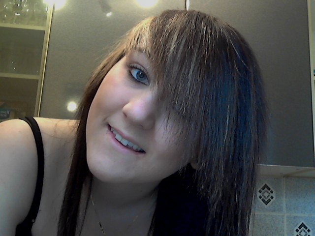

This is the actor we have used as our threat. we chose this actor as she is part of our group and so we know she would be reliable. in relation to the conventions of a ghost horror film, we were able to make her look like a frightening threat with the use of make-up and a wig. The dark wig covered a lot of her face, just like in the ring. We used white body paint to make her look pale, and eyeshadows were used to create bruises and give her a dark look around her eyes. we followed the conventions of a ghost horror film when creating our threat.
This is a spider diagram I did listing the conventions of the ghost horror film genre:

In reference to our storyboard (posted below) we have followed the conventions as much as we could, considering this is just the beginning of our film. For example, when the young girls mum leaves the house we can hear the threat outside in the bushes, following the convention that the threat can be implied, not shown. The young girl is also in an inescapable environment when she is trapped in her room at the end. The make-up is the convention which we have followed mostly, making sure out threat is convincing and would frighten the audience. Our target audience research shows that we haven't been too specific with our social groups as we want to appeal to a wider audience, however it is aimed at young adults, over the age of 15 as this is the rating of our film. We want to appeal to both genders and any race. We thought that the story line wouldn't be specifically fit for one social group, but to many.
Storyboard:

In our film, there is a sequence where the young girl helps herself to a beer and rings her friend telling her to come round because her mum has just gone out. This is showing that teenagers are rebelious as she wouldnt have done this if her mum was in. This could also relate to gender - girls are seen as more vulnerable than boys which is why she may have rang her friend to come round so she is not by herself. In comparsion to our film, The Ring also shows both the same stereotypes from our film. 2 teenage girls are home alone and talking about boys and gossiping which conforms to female stereotypes. In both films the girls are vulnerable and trapped inside their houses when the threat is established. We have created representation by following stereotypes linked with the social group in our film - teenage girls. We have shown her being vulnerable when the lights go out so she cannot see what might be in darkness. We have also represented her as being rebelious, and doing things she wouldn't usually with her mum around.
FEEDBACK
Question 3 - Distribution
What kind of media institution might distribute your media product and why?
This is my film poster I created:

These posters have inspired me whilst creating mine

This poster for the Ring 2 inspired me because the threat is very similar and the writing is creepy, the threat isn't very clear either leaving a sense of the unknown which will make the audience wonder about the threat.

This poster for The Grudge also inspired me because i like the close up of the threat, even though my poster is a long shot and you can see the whole of the threat, the hair and the writing are similar to those on my poster.
Release diary :
September - release trailer onto all main channels on television and before similar films in the cinema so it will get publicity in time for halloween.
October - release into main cinemas across the UK mid - october. Halloween is a perfect time for a horror film to be released into cinemas as this is the peak time when people watch horror films and so will bring in a fair amount of money.
November - film no longer available in cinemas but an advert is released advertising it on DVD in december.
December - film comes out on DVD in time for christmas so this will bring in a lot of money from christmas sales.
Advertisement campaign :
The sample poster will appear on bus stops, on the side of buses, on billboards, on telephone boxes, in cinemas etc. Any place which will be seen by a lot of people, so especially in town centers.
The trailer will be released in september onto television channels and into the cinema before similar films. It will also be available on the internet before anywhere else, giving people an exclusive look at the film.
Similar film trailers:
The Ring - http://www.youtube.com/watch?v=gs_TFlTETH0
The Grudge - http://www.youtube.com/watch?v=p_1ypNaIRHI
Production Logos
This is our production logo we created on photoshop:
Monday, 23 April 2012
Question 4 & 5 - Audience
Who would be the audience for your media product?
It is important to know the who the audience for our film would be because that way we know what type of thing would attract them and follow the typical conventions of the horror films of this typical audience group.
After researching similar horror films from the same genre, the main audience of our finished product would be males aged 18-29. The horror films I looked at were 'The Others', 'Sixth Sense', 'The Ring 2', 'Dark Water' and 'The Orphanage'. Males aged 18-29 all rated these films on IMDB (internet movie database) more than any other group.
Our film would appeal to this group because woman are thought to be more affected by horror films and so do not enjoy them as much as men. The age group is also quite young and they are thought to have sensation-seeking personalities.
The Others was released in 2001 and is certified a 12.
Plot: a woman who lives in a darkened old house with her two photosensitive children becomes convinced that her family home is haunted.
IMDB user ratings:
Votes
Average
83,691
24,798
1,185
715
460
57,971
42,433
15,150
41,754
33,887
7,421
7,695
6,028
1,544
22
774
25,982
77,216
IMDb users
133,232
Males aged between 18-29 rated this film more than any other age group.
Sixth Sense was released in 1999 and is certified as a 15.
Plot: A boy who communicates with spirits that don't know they're dead seeks the help of a disheartened child psychologist.
IMDB user ratings:

Males aged between 18-29 rated this film more than any other group, suggesting they are they highest viewers of the film.
The Ring 2 was released in 2005 and is a certified 15.
Plot: Six months after the incidents involving the lethal videotape, new clues prove that there is a new evil lurking in the darkness.
IMDB user ratings:
Again the most ratings come from males aged 18-29.
Dark Water was released in 2005 and is a certified 15.
Plot: A mother and daughter, still wounded from a bitter custody dispute, hole up in a run-down
apartment building. Adding further drama to their plight, they are targeted by the ghost of former resident.
IMDB user ratings:
| Votes | Average | |
| Males | 18,141 | |
| Females | 4,376 | |
| Aged under 18 | 199 | |
| Males under 18 | 114 | |
| Females under 18 | 85 | |
| Aged 18-29 | 11,619 | |
| Males Aged 18-29 | 8,930 | |
| Females Aged 18-29 | 2,623 | |
| Aged 30-44 | 8,823 | |
| Males Aged 30-44 | 7,423 | |
| Females Aged 30-44 | 1,335 | |
| Aged 45+ | 1,878 | |
| Males Aged 45+ | 1,560 | |
| Females Aged 45+ | 300 | |
| Top 1000 voters | 464 | |
| US users | 6,542 | |
| Non-US users | 15,226 | |
| IMDb users | 27,035 |
Males aged 18-19 significantly rated this film more than any other group.
The Orphanage was released in 2007 and is a certified 15.
Plot: A woman brings her family back to her childhood home, where she opens an orphanage for
handicapped children. Before long, her son starts to communicate with an invisible new friend.
IMDB user ratings:
Males aged 18-29 again significantly rated this film more than any other group. As with all the films I
have researched, males were more likely to watch horror films and rate them.
BBFC stands for the British Board of Film Classification. They have rated every film ever made, includingthose I have researched above. The Others is a 12 meaning that in terms of horror moderate physical and psychological threat may be permitted, provided disturbing sequences are not frequent or sustained. Moderate violence is allowed but should not dwell on detail. There should be no emphasis on injuries or blood, but occasional gory moments may be permitted if justified by the context.
Many horror films are classified as 18's as they may contain any detailed portrayal of violent or dangerous acts, or of illegal drug use, which may cause harm to public health or morals.
This image taken from our film shows why it is a 15. You can see the threat outside the window, and as the BBFC website says that it should be classified as a 15 if a strong threat is consistently shown. There isn't anything gory or violent shown in our film, and it would not cause any harm so it doesn't need to be a 18.
Our film represents issues such as age in the way that the young girl is seen as vulnerable and rebellious. Class or race aren't addressed as it is only the beginning of the film. This representation suggests that our target audience would be similar to the girl in the film. We want people to be able to relate to the situation and so find it frightening. They would identify with the fact that the girl is young and alone and so is vulnerable. She is a teenager and has a free house and so invites her friends round which is typical of teenagers. The audience would relate to the situation and so it would appeal to them.
For our film i think the audience will typically be young aged males. This is because, from the research I have done, males ages between 18-29 rated the films the most on IMDB. However saying this, I think our particular genre (ghosts) is more popular with females than other genres, as this genre isn't that frightening compared to other genres such as psychological films.
We planned our film to engage our target audience as mentioned above, we want the audience to be able to relate to our film. I think they would enjoy our film as they can identify with the story. They will be looking to see a house party and the typical things teenagers get up to however that of course doesn't happen due to the threat appearing.
We didn't target a particular age or gender as we want to appeal to a wider audience however we feel that after research males ages 18-29 would typically enjoy this film. It is aimed at quite a young audience and both genders.
We chose a house as our location - a person in our groups house so that we would be able to use it when we liked and this is more reliable. When we planned our film, we planned it around the location, and how we would be able to film it in this house. The props we used include a mobile phone, beer, a laptop, a lamp etc. This will engage the target audience because they will see that these are typical things which are found in the household. It helps to conform to conventions because the props are things you would expect to be in a household and the location is in an enclosed place meaning it would be hard for the victim to escape.
The casting of our threat and victim helps to engage the audience because they are both teenage girls, the victim fitting with teenage girl stereotypes, the threat challenging them. We chose these as our actors as they would be reliable and fit the story-line well.
Our title sequence will engage the audience by making them wonder who the threat is and why she is killing the victim - what is the threats motive? Baby pictures of the threat are also shown suggesting maybe the threat had a bad childhood and that is why she wants to kill.
Here are some images from our title sequence:
These show images which will make the audience curious and want to keep watching.
Our music in the title sequence involves tense music and a heartbeat. This music makes the audience feel tense as they watch it and as it has been put with the images it makes it creepy and again the audience would curious.
Subscribe to:
Comments (Atom)