Thursday, 26 April 2012

Question 2 - Reflective Evaluation - Kristy Simpson

Representation is important within films in order to create something realistic for the audience to believe.
In our films we have used different conventions to represent different social groups.

Our film represents two social groups. It represents teenagers and mums.
Representing a teenager was easy, as I am one myself, so I already know the conventions associated with teenagers. I knew that to represent a teenager you had to use a few of these conventions:
·        Hanging out with their friends
·        Swearing
·        Drinking
·        Loud music
·        Can’t put their phones down
Etc….
Our film clearly represents the typical teenage girl!
The first few shots in our film really conform to dominant ideologies because straight after her mum has left we see her go to the fridge to get a beer and then call her mates up to invite them round. This is a typical teenage thing to do and I thought that our target audience would be able to relate to Robyn, as I’m sure that most people have done this at some point.
Also when she goes up the stairs I thought that it would represent a teenage girl best if she went straight to her computer and went on facebook or something.
Another teenage stereotype we put into the film was swearing, when the power goes out she swears and grabs for he phone, conforming to other the ideologies of swearing and cant live without their phones.
  Although the mum wasn’t in the film for long, two shots, we still had to represent her social group through her in the time she was in the film.
Although the audience don’t know where she is going we can see from her outfit that she was going out somewhere nice because she was dressed in “going out clothes”.
Usually mums have a close relationship with their daughter, which was clearly shown through the beginning of the film when she calls her to say goodbye and kisses her as well.


I am going to analyze the part where the girl is in the bathroom, after she has chosen her new room.
The two characters I want to analyze are the girl and the ghost girl, the threat.
The girl represents a typical teenage girl.
She is the victim, which conforms to dominant ideologies, girls are used because they aren’t masculine and butch so they seem more vulnerable.
Another ideology this scene conforms to is that girls get excited and she gets excited about finding a room she likes.
Another ideology about girls is that they care about their appearance and in this clip she stands in the mirror doing her hair and grooming herself.
The ghost is represented because she is stood their watching the girl in the mirror and the alive girl can’t see her.
The threat is also a girl, which conforms to conventions in the ghost sub-genre.
When the threat is watching the girl in the mirror she starts to copy her, almost as if she has forgot what it is like to be a girl and have to care about your appearance.


(This video wouldn't upload)

The victim is a young boy. His gender challenges dominant ideologies because boys are supposed to be fearless and brave. Usually they use young girls to make them seem more vulnerable but because they have used a boy it shows how scary his situation is.
The ghost is of a woman, which he mistakes for his mum. They obviously wanted her to be like his mum to make the situation less frightening and shock the audience when it isn’t.




Question 6 - Prezi

http://prezi.com/yphkhsgn_mdv/copy-of-technologies/

Question 1 - In what ways does you media product us, devlop or challende forms and conventions of real media products?

A convention is a set of agreed, stipulated or generally accepted standards, norms, social norms or criteria. Applying this to a media product, conventions are particular things that an audience expects to be in that genre/sub-genre. Different audiences of different ages and genders are drawn to particular films for the atmosphere that the film creates or even the type of characters that are involved in it.

 
These images establish the sub genre of the Film. The audience can see that they are both a demand kind of threat due to the ‘Spider crawl’ of the bottom character and the satanic symbols on the top character. Both of the pictures include stairs, this makes an atmosphere as in both scenes the ‘Threat’ character either crawls up the stairs or down them in a jumpy and creepy manner.
Our image uses existing conventions from our sub-genre of ghost/demand as it uses a young girl character that is ‘stalking’ another female character. We also used mise-en-scene to establish a more ‘innocent’ character, such as using a white night gown to show purity. This also uses existing conventions as our chosen sub genre creates a lot of suspense.
Our stairs scene challenges a convention of shot type. Usually a low angle would be used so the audience feels powerless against the threat, however we used a high angle, this was to make the audience feel like the character was crawling up the stairs towards them, so it outs the audience into the other characters place.


These shots establish mise-en-scene. They give an immediate visual hint to the audience to where the ‘action’ will take place. My image uses this to build an atmosphere of suspense, the audience can see the house and also a character leaving the location. This fits in with the storyline as the audience know that a young girl is left inside alone.
A main convention of a ghost/demand horror film is that there is a creepy/old house where weird things happen. My image challenges this as compared to the bottom image from ‘The ring’, the location just looks like a normal house and builds no atmosphere. The bottom image gives off a different mood, the location is a lot more supreme and in power compared to the audience. The low angle shot and dark lighting gives a creepy atmosphere and makes the audience feel on edge. In my scene, the harsh bright lighting doesn’t give this dark effect so atmosphere is lost. Also, the camera angle is eye-line so n power is made between the audience and the location, overall the scene is quite neutral.


These images show the production logo from ym film and the logo from one of our main inspirations 'The Ring'. Our logo has a satanic sign on it, which alot of the audience will be able to recognise. This immediately tells the audience what genre of film is. We have also smudges the red writing to make it look like it is oozing with blood. The ring logo represents the filn, it goes all pixelated over the dreamworks logo just like a tv would. The colours are also dark and creepy.


Question 6 - What have you learn about the echnologies from the process of constructing this product?


This is my prezi to give you an idea on what i learn while making my media product.

Question 3 -What kind of Media institutions might distribute your media product and why?

Distribution is a huge part of the media industry, distribution is the way in which a product is made available to the public and audience. The higher quality the distribution of a product, the larger the audience that will be attracted and the more profit will be amde. There are many techniques in which a product can be distributed; Trailers, Cinema released and posters are just a few examples.

Major media institutions are large companies that are well known in the film inductry, they produce high budget films that create alot of interest from the public.

Twisted Pictures
Twisted pictures is an American production company, mainly creating films of the horror genre. Founded in 2004, Twisted pictures is highly known for its creation of the SAW series.

This is the official trailer and a poster for the advertising of SAW 7 (3D) released in 2010. Both the trailer and the Poster are vet exhilarating, which will attract an audience. Also this is the last addition to the saw series, overall 7 films have been made. This shows that Twisted pictures is a major media instituion as it has been able to keep up 7 films, without the audience loosing interest. These films have been popular worldwide and have made a high profit. Because of its sequel, SAW took to the audience immediately and everyone new about it. Posters, Trailers and TV advertisments helped this along.

Independant production companies are companies that are alot smaller than Major institutes and compete with them. They make smaller budget films which do attract an audience but very often do they make a huge sequel like Twisted Pictures have.

Hammer
Hammer is a film production company based in the United Kingdom. Founded in 1934, the company is best known for a series of Gothic "Hammer Horror" films. Hammer also produced science fiction films and thrillers.
Hammer has recently created a new films know as 'The woman in black' Which has been highly popular. The films starred Daniel Radcliffe (from HArry Potter), this is huge for an independant company as it has brought it alot more of an audience.

http://www.youtube.com/watch?v=7lReemWmO5o

This is the official trailer and the advertising poster for the woman in black, released 2012. Social networking sites played a big part in the distribution of this film, people heard about the inclusion of Daniel Radcliffe and word spread. Posters and trailers with Daniels' face on it would immediately attract a huge audience (even Harry potter fans).

Fantastic Films
Fantastic Films is an independent film company developed in 2000. Horror, comedy, thriller and action films are what they are mainly know for. However Fantastic films aren't that well known and target a small niche audience. Distribution of Posters and Trailers is what they mianly use as Advertising by TV is high budget.

http://www.youtube.com/watch?v=iF9TfbDmA_0

This is the trailer and the Advertisment poster for Wilderness released 2006. The trailer seems good, but a little bland. IT wouldnt really interest a large audience and seems to be a little low budget.
_______________________________________________________________________________


These are two films and there posters that inpired me the most.
They both use a female threat, that is a deamnd kind of character, both are dark in colour and seem creepy.


To distribute my film, i created a sample film poster, I used a darkesh theme with a smailing still image from my film to represent the title. I used a contrast of black and white so that the poster would be clear and the audience wouldnt be able to see it.

My poster will appear around colleges, bus stops and cinemas. This is where i suspect my target audience to be, so my poster whouls attract their attention and engage them into seeing my film in the cinema.
The trailer will be released not long after the poster.

The Dates for Cinema Release and DVD are:
15th May – Trailer is released online, online viewers can access this on sites such as youtube.
1st June – The trailer is also released on TV, all viewers can now access the trailer and poster.
10th June – Released in cinemas in the UK
3rd August – DVD release in the UK. Blue-Ray and normal DVD's are sold in both shops and online shops.


Question 1 - Reflective Evaluation - Kristy Simpson


For the first question I have to show how our film uses, develops or challenges conventions of existing horror products. I will do this by finding 9 key images from my film and 9 images from existing films and talk about how they show conventions and how they inspired us.
Conventions of horror films are almost like laws you have to follow in order to create a successfully, frightening horror movie. There are different conventions for different sub-genres; these are a few conventions for the ghost/demon sub genre and how our film represented them.


This is the Red Letter Studios logo used in the opening of their films. The use of red to create the cross looks quite gruesome, as it looks like splattered blood. Crosses are religious but because of the colour and style it has been drawn in we know it represents something dark.  The font used is also effective because it looks aged and it is a conventional horror font.


This is our logo we have created for our production company, Satanic Productions. We have used the blood convention and smudged the words to make it look like blood dripping; also the colour of it is red. We have used a symbol, which most people can relate to as a witchy/evil symbol. We used a black background because we found most horror production logos do this, we can relate the black background to horror because evil usually takes place in the dark. 


_________________________________________________________________

Establishing Sub-genre

This image is from the ring. We can see it is from the sub genre, ghost/demon because we have a dead girl climbing out of a well. We can tell she is the threat character because of the convention used, black hair over her face. Also because of the mise en scene, she is crawling out of the black water, black is associated with evil.


This image establishes our sub genre, ghost/demon. It uses the conventions developed from the ring; in the way our threat looks with long black hair, pale skin and dirty clothes.
We also used elements of the way Samara climbs out of the well, in a very un-human distorted manner.


_________________________________________________________________

Establishing Character

This image is from the ring. The character, Katie, is clearly a young teenage girl; in horror films we usually find the victim is a girl. We can see from her facial expressions she is scared, this is a typical convention of ghost/demon. She is wearing a short skirt, which is something young teenage girls do.


From this image we are introduced to our character, Robyn. The mise en scene, she has a drink in her hand and is on the phone, develops conventions of a typical teenage girl. We have also used the convention that the victim is often a girl. Also the dark window behind her is quite spooky, we already know something is watching the house but we can’t see anything.


_________________________________________________________________

Establishing Mise En Scene

This shot shows good mise en scene as it not only establishes location but also shows the mother leaving her child home alone. We used the horror convention by positioning the camera behind a bush to make it look like something was watching the house.


This is an establishing shot from the ring. The mise en scene shows us that it is nighttime. This is a convention of the ghost/demon sub-genre because usually bad things happen at night. The mise en scene shows us where the characters are, in the bedroom as it is the only light. It also shows us that the house is quite big, the location in the sub genre is usually a big, haunted house.


_________________________________________________________________


In this image from the ring 2 we can see Samara reaching out towards the woman sat in front of the TV. The colours are very dark and dull representing evil. The position of Samara suggests she is trying to grab someone, developing the conventions of ghost/demon sub-genre because the threat is always trying to get somebody.


In this scene we can see the threat is stood in front of our character when she lights up her phone after the power cut. We believe this is a key image because it shows the climax of our film; the threat finally meets the victim. We have used conventions because ghost/demon films have jumpy scenes where the threat is all of a sudden just there and this is a jumpy scene where the threat appears out of nowhere.

_________________________________________________________________


This image is from Thir13een Ghosts.
This image shows a ghost standing behind the girl who is looking in the mirror. We can tell she can’t see the ghost because of her facial expression, this challenges conventions as the ghost is stood behind her but she isn’t scared. We can tell she is a ghost because of her pale pallor, long wet hair and smudged makeup, conventions of ghost/demon sub-genre.

This scene is key to our film because we are introduced to our threat, it is the first time we properly see it. The threat pops up behind where the victim was stood, the victim is unknowing. We used this convention, where the characters have no idea what is coming for them. We also used the convention of the pale white pallor, so you can clearly see the threat through the black window.


_________________________________________________________________

This image is from the ring, I thought it was key because it represented the first time in the film that Katie knew something was wrong. Her expression is conforming to the conventions of horror because she is scared.
Also her gender and age conform to the conventions of horror as she is a teenage girl. 


I think this image is key because it is also the first point where Robyn realizes something is wrong. We have conformed to horror conventions by making her get up and check what has made the light come on, often in horror films the characters get up and walk into the pitch black cellar to check it out.


_________________________________________________________________

I thought this was a key image in our film because it kind of shows that can’t escape it. We have developed the convention that the threat can be anywhere, one minute you see it on the stairs, then it is in the bathroom, it is closing in.


 This image is from the sixth sense, when Cole helps the ghost Kyra. It uses the conventions of a child being the victim. We can also see the child is scared, so it develops the conventions of fear, we also know that he is about to face something because we can see his hand getting closer, it is building tension.


Question 1 - Conventions

In what ways does your media product use, develop or challenge forms and conventions of real media products?

Production Logos:


The Hammer Production logo is simple and yet still follows the conventions of the ghost sub-genre. The colours imply danger and inspired us when creating our logo to use similar colours. We used the red, and our font makes it look like blood. We used a satanic symbol as this relates to our film and the name of our production company. We thought the background of the Hammer production was a bit plain so in ours we included grey and red scribles to make it look more appealing and eye-catching.


Title Sequences:


These are images from our title sequence and an exisiting films title sequence. The titles in the exisitng film are again yet simple and do not give too much away - it is just a black background with an image of lips. The image taken from our title sequence also doesnt give too much away although you can see more than you can in the other films title sequence. It inspired us to use simple yet effective images and to not give too much information to the audience.


Sub-Genre:        


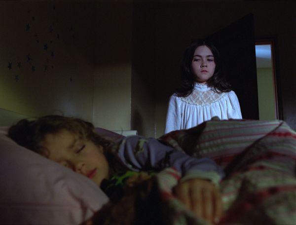
This is an image from orphan, which is a film in our sub-genre. The image shows the threat standing over the victim whilst she sleeps. It follows conventions of the sub-genre as the victim doesn't always know the threat is there. Facial expressions of the threat also show how lethal she may be, and how she feels about her victim. This inspired us to use similar facial expressions and for the threat to behave in a similar way. Our image shows the threat climbing up the stairs in a creepy way to show the audience that the victim is not safe.


Establishing Character:


Both of these images establish the relationships between the characters and the role these characters will play. In the sixth sense, the doctor is talking to the little boy and trying to comfort him. In our film the mother is going out and so is kissing her daughter goodbye, you can tell just from this that they are both nurturing characters. This helped us in our film to establish this role. The sixth sense follows conventions of our sub-genre as the boy has mental issues which occurs alot in our genre.

Mise-en-scene:


These images both show mise-en-scene used in horror films. The first image is taken from the film Oprhan and shows a good sense of location and also includes a prop and costume. You can tell from the costume and location that it is winter in this scene. In our film, we were inspired to show the action for the threats point of view in the bushes. The main factor in this shot is the location. We can see that it is a big, well-kept house through the use of the wide shot.The threat gets a lot of screen time through the use or editing in Orphan, so we decided to do the same thing, helping to establish the character.  


4 Key Images:


The first image here is taken from The Ring, it shows the famous video tape which you die after watching. The second image is from our film, showing the threat reflecting through the lightswitch. We tried to come up with different ways to show the threat to make it more interesting and so to include more shot types. The story-line from The Ring helped us when we thought of our film as it is quite similar in terms of the threat. Both images conform to stereotypes of the ghost sub-genre as ours is showing the threat, and The Ring image is introducing the story-line.


Both of these images are very similar, and the image taken from Orphan inspired us with our threat. The facial expressions conform to the steretypes of a threat and so we tried to re-create this kind of image with our threat. You learn a lot about the character just from the facial expressions and body language in these images. The lighting in orphan helps the audience to clearly see the threats facial expression however in our film there had just been a powercut when the threat appears so we had to keep the lighting dark and not give too much away.


Both of these images show the threat coming into the story-line without the victim knowing. The bottom image, taken from Insidious has used lighting to conceal a lot of the threat from the audience, making them afraid of what they cannot see. This particular image helped to inspire us in our film with our threat popping up from no where. As with the image in insidious, you cannot see the whole of the threat and so leaves the audience wondering. The location which we used was appropriate and linked with the story well.


The first image here is taken from the film The Roommate, which shows a two-shot of two girls, and gives the audience a sense of the story-line from the mise-en-scence, mostly body language and facial expressions. One girl is creeping up on the other, following conventions of a horror film and so we tried to include this in our film. The second image here taken from our film is taken from inside the fridge when the character is getting a beer out of it. This inspired us to use a varitey of shot-types.