

A number of posters were insparational when I was thinking about my poster. I wanted to use the same technique that so many other horror film posters used.
One thing I notice about all these posters is that they have the threats face in the middle, the title at the bottom and a catchphrase at the top, the catchphrase is the first thing you should logically look at. 
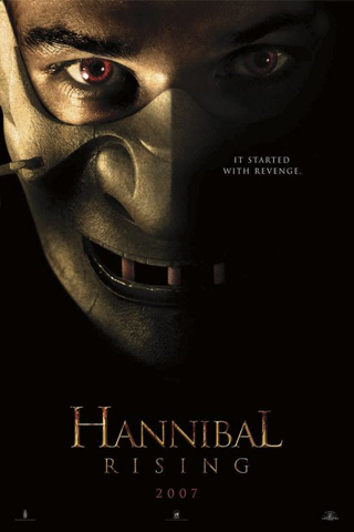 I think this layout is effective because you can see the threat, but the threat is surrounded by darkness which makes them more threatening because there is a lack of light, you can't see what they are doing or where they are. Also this layout is very simple and eye catching. If there is too much going on in the poster people won't have time to digest all the information. Just a simple picture, title and catchphrase is all it needs, I believe.
No comments:
Post a Comment